Sunday, May 16, 2010

Yay, Cathleen!

My friend and fellow IHP Design Team member, Cathleen Torina, is this week’s Featured Stamper over at Splitcoast Stampers. I’m over-the-moon thrilled for her, and she SO deserves it!

The deal is that you pick one of the many amazing cards in her gallery and find one to do over your own way. I think you’re supposed to use a different image, but since I have the image she used on this card, and I’ve had a hard time using it, I figured I’d use her same basic layout (‘cause I loved it so much!) and just change the colors up. I also didn’t use quite as many layers or details as she did.

ctorina-case

What I used:
Stamps:
Thank You (cling - Hero Arts)
Ink: Memento Black,
Copic markers RV06, YG25
Paper: White, 2008 Bitty Dot Basics (
PTI)
Other: Buttons and ribbon from
PTI, Big Scalloped Petite Borderabilties

I hope you’ll go over and take a look at all of Cathleen’s gorgeous work – she’ll inspire you the way she does me!

CMsignature

Saturday, May 15, 2010

Fairy Door

Up until last weekend, I had barely heard of Fairy Doors and certainly had never seen one. But I was in Ann Arbor last weekend visiting my son and daughter-in-law for Mother’s Day, and as we were walking along S. Main Street my DIL pulled us aside to show us this magical sight:

fairy-door

Teeny-tiny. I don’t think it was more than a foot high! And absolutely perfect in every way.

I believe in fairies.

CMsignature

Monday, May 10, 2010

Bring on the Cake

Today i {heart} papers is releasing a new batch of Chicken Girl goodness! The May release of the Chicken Girl Designs digital stamps has such fun images that I couldn’t resist pitching in to help introduce them.

cgd-kittycake1 This is the Kitty Cake image, one of four being released today. The words are from the Hero Arts set Essential Messages. I just cut them apart and matted them for emphasis. The patterned paper is from the Basic Grey Kioshi 6x6 pad. I ruffled some white silk ribbon behind the focal image using i {stick} papers redline tape. As you can see, I didn’t do a perfect job of it, but I’m learning to forgive myself.

OK, here’s the full May CGD release. Tell me, how can you possibly resist these?!!

maydigicollectionGo check out what the Chicken Girl Design Team did with them:

Christy
Loretta
Lori
Tammy
Carlie
Michele
Laura
Kate

And I wouldn’t be surprised if some of the other i {heart} papers design team members have something to show you too.

Now isn’t this a great way to start off the week?

CMsignature

Friday, May 7, 2010

Mint Motif at IHP

Today is a very special day at i {heart} papers! Yes, of course it’s Friday, but today also begins the sneak peeks for IHP’s newest exclusive stamp line, Mint Motif, designed by Kimberly Crawford. Over the coming week you will see peeks of the two coordinating sets, Very Square and Very Square Sentiments, which will be fully released on the 14th. I’m so excited for Kim, and I can’t wait to get my hands on my own set!

So do you want to see the peeks? Go check out Mint Motif’s fabulous design team:

mmdt 


Kimberly Crawford – designer
Charlene Austin
Latisha Yoast
Geny Cassady
Kazan Clark
Julie Overby
Kate – owner

Have a great weekend!

CMsignature

Sunday, May 2, 2010

Happy Anniversary, Laila & Roy!

LRanniv10

Today is my daughter and son-in-law’s second wedding anniversary. Wow, time has gone by so fast! And it’s so wonderful to see how happy they are. My kids have excellent taste in spouses!

Since I am on a butterfly kick these days, I couldn’t resist picking up these gorgeous Martha Stewart stickers when I was wandering around my local paper crafting store last week. And then when I found an amazing pad of K and Co. specialty papers (Que Sera Sera) that went perfectly with them, I had to have that too. It’s very dangerous to wander around that store! I’m gonna have to find someplace else to aim for on my lunchtime walks.

I used one of the sketches from the Verve sketch challenges last month, so it’s only fitting that I used a sentiment from their Anniversary Birds set. 

Hope you’re all enjoying your weekend! Wish it could last a little longer…

CMsignature

Saturday, May 1, 2010

“New Life” Cake

 I know that most of you who visit my blog come expecting to see cards, but once in a while, for special occasions, I take off my paper crafting hat and put on my cake decorating hat.

Now, I am not a professional baker by any means, but I was honored to be asked by my sister to make a cake for the very special party she threw this afternoon celebrating her triumph over a serious health challenge. Throughout this one-year journey she has shown such strength and courage, and she asked for a cake that symbolized rebirth and renewal. After a great deal of thought, butterflies seemed like the perfect choice.
butterflies For those of you interested in the details, the tiers are 12” and 9”. The top tier is butter cake filled with chocolate hazelnut buttercream, and the bottom layer is chocolate cake filled with chocolate ganache, raspberry filling, and fresh raspberries. It’s covered in buttercream flavored fondant. The butterflies are completely edible – edible ink printed on edible wafer paper. I glazed them with a thin coating of piping gel and cut them out, bending them in the center, before they dried completely. They’re attached to the cake with little dabs of piping gel.

By the way, it was an AWESOME party, with a live band, and my super-talented brother jammed with them at the end. And I danced. A lot. And drank a lot of wine. I think I need a hot shower and a nap. OK, maybe a nap first.

Life is good.
CMsignature

Sunday, April 25, 2010

April PTI Blog Hop – Tissue Paper

bloghoplogo This month’s theme for the PTI Blog Hop was to use tissue paper. Well, PTI stamp sets come wrapped in tissue paper, and I just so happened to have the paper from my latest order handy. I knew I wanted to make a flower from it, and I wanted to use some the new Dotty Biscotti paper. I almost never use Kraft cardstock, and I think I bought that paper to force myself to use it more.

PTIbloghopApril10

I folded a piece of the tissue paper up to get a bunch of layers (10-12) and ran it through my Big Shot with the larger PTI Dahlia die. Then I took my Copic airbrush and RV25 marker and tinted the pieces, concentrating on the outer edges and leaving the centers lighter. I poked a hole in the center and held them together with a rhinestone brad, and then scrunched and fluffed them up a layer at a time, from the top downward. Here’s a closeup:

PTIApril10closeup

Of course I had to add some more bling to complement the flower center, so I punched out a few butterflies with a Martha punch and added some rhinestones to them.

The layout was inspired by one of the sketches in the new PaperCrafts Go-to Sketches magazine (p.144), but specifically by Kimberly Crawford’s card on p. 145. What a treasure that issue is—so full of inspiration!

What I used: (All PTI unless otherwise noted)
Stamps: Signature Greetings
Ink: True Black
Paper: Kraft, Raspberry Fizz, Dotty Biscotti
Other: Rhinestone brad (SU!), clear rhinestones (Hero Arts), butterfly punch (Martha Stewart)

The Hop starts at 8:00 tonight, and I can’t wait to hop around and see what all the other fabulous stampers did with this month’s challenge!

CMsignature

Saturday, April 24, 2010

Wedding Invites

I just finished up an order of wedding invitations for a super-sweet couple whose guest list kept growing and growing! We started out at 150 and ended up at 190. That’s 190 invitations, folks — not guests. So yeah, I’ve been busy! I do love working with couples on their invitations, though. There’s something really special about making their vision come to life and having a small part in such a special occasion.

CWinvite-closedAnyhow, here’s the outside. I used Vertico pocket folds from cardsandpockets.com in Champagne. This is the equivalent of Stardream Opal, if you’re familiar with that. The monogram seal was done with circle punches. TIP: I printed the monograms in the cutting borders of the invitation panels to cut down on waste.

This is the invitation opened up. All printing was done on 80# Creamery Felt cardstock, so it has a lovely texture  that contrasts nicely with the smooth shimmer of the pocket fold.

CWinvite-open The flourish is stamped with Papertrey’s Fancy Flourishes stamps in Brilliance Platinum Planet, which is a shimmery pigment ink that matches the outside of the invitation perfectly. Here’s a close-up:

CWinvite-closeup In case anyone is wondering, I do my invitation layouts with Adobe InDesign. If you have any other questions, please feel free to leave a comment and I’ll do my best to answer.

I hope Christine and William don’t end up spending this whole beautiful day inside addressing and stuffing envelopes. Tomorrow it’s gonna rain!

CMsignature

Tuesday, April 20, 2010

April Showers Bring…

april-IHPchallenge-closeup This month’s challenge for the i {heart} papers Design Team was to use flowers. Well, that’s an easy one for me! So I decided to combine it with this week’s sketch challenge from Our Craft Lounge. I must say that it did turn out to be an unusual color combination for me.

I started with the beautiful bouquet image from the Flowers For You set (an oldie by goodie that Kate happens to have on sale!). I colored it with my Copic markers (see below for the colors), and then went about figuring out how to give it some texture and dimension.  OCLDT09

The first thing I thought of was Flower Soft, so after I cut it out with my Nestabilities, I used some of the new Ultra Fine stuff and tiny little dabs of their glue on the flowers that appear towards the back of the bouquet. Then I remembered that I had some adorable tiny wired roses in my stash. I punched two small holes at the sides of the stems where I wanted them to be tied together, and ran some narrow golden yellow silk ribbon through, catching the stems in it and tying it off tightly on the back. I made a small bow using the same ribbon and my Bow Easy, and attached it with a couple of mini glue dots, hiding the holes I had punched.

april-IHPchallengeI had chosen my colors with the plan of using this paper from the Basic Grey Green at Heart 6x6 pad. I think the “grandma’s wallpaper” feel of this piece complements the bouquet nicely. I have no idea what made me use the yellow, but I think it just makes the card look so sunny and happy!

What I used:
Stamps:
Flowers for You
Ink: Memento Black; Copic markers (YG93, G94, G99, RV19, RV29, R21, R22)
Paper:
Green at Heart; Old Olive, Summer Sun (SU!); Berry Sorbet (PTI)
Other:
Golden Yellow 1/4” Silk Ribbon, Bow Easy, Circle and Petite Circle Nestabilities, wired roses, Flower Soft, SU! circle punch, PTI twill ribbon 

We’d love to have you play along with the IHP challenge. Surely you can think of a way to use flowers! If you post it to one of the galleries (SCS or PCP), use the tag/keyword ihp0410 so we can find it. Check out what the rest of the design team did, and then make your own. 

Happy stamping!

CMsignature

Thursday, April 15, 2010

Happy Anniversary!

YJ-anniversary1

Today is my son and daughter-in-law’s first wedding anniversary. I’m gonna assume that this card will be getting there on time today, so I’ll go ahead and post it here. My kids seem to have a talent for adding awesome people to our family, and I feel so blessed that they are all so happy.

Anyhow, these two lovebirds (on the card, I mean) were made with the SU! punch and my SEI Claire 6x6 paper pad. The card is full of texture – the cream center piece, cut with the Labels 4 Nestabilities, is some of the luscious velvet paper from the matching Claire Velvet Paper assortment. See, it cuts like a dream, and you can stamp on it! And the Claire patterned paper has some gorgeous foiled designs in it, adding even more texture. The anniversary greeting is from the oh-so-versatile Hero Arts set Everyday Sayings.

cutting-cakeAnd because I can’t help revisiting that wonderful day a year ago, here’s a picture of the real lovebirds cutting their Chicken Wedding Cake. (If you want to see more about the cake, go back and see this entry.)

I can’t believe it was a whole year ago, and I’m so excited that I’ll be visiting them next month for Mother’s Day. I miss them since they moved to Michigan!

Oh, and happy Tax Day, everybody!

CMsignature

Monday, April 5, 2010

Just Sailing By…

sailing-by-gts When I finally got my hands on the new Paper Crafts Go-to Sketches magazine last week and saw the sketch on p. 68, I knew exactly what I wanted to do with it! This super-adorable digi-stamp from Chicken Girl Design was just made for this sketch!

I printed it out on some of the new medium-weight Copic cardstock that Kate is carrying at i {heart} papers, as well as on some Brocade Blue. With digital stamps and MS Word (or most any other program that handles graphics files), it’s easy to use the cropping function to print only selected parts of the images.

The little scene is colored with Copic markers, which I unfortunately put away before writing down the colors I used, and the background is airbrushed with Copics. The waves are the reverse cut made with my Big Scalloped Petite Nestabilities, the added bonus being that I now have a pretty scalloped piece of Brocade Blue waiting for another project.

I cut this card shorter than usual to accommodate the sun sticking up on top, so it’s actually 3-3/4” x 5-1/2”, and it will fit in a regular A2 envelope.

There are so many great sketches in that magazine – it’s sure to jumpstart anybody’s flagging mojo! Can’t wait to play more with it…

CMsignature

Saturday, March 27, 2010

Hippity-Hoppity (variations on a theme)

When I saw this adorable Easter card by Julie Ebersole yesterday, I couldn’t stop myself from running out and picking up a Martha Stewart bunny punch of my own. I loved how she used the paper from Basic Grey’s Green At Heart for the ground, and I’ve been wanting to dig into that paper since I got it from i {heart} papers last week. I was turning her idea around in my head all night and then this morning I had a sort of vision of how I would adapt it to make it my own. 

easterbunny1 I’m so excited that it came out just as I had pictured it in my head! I’m sure you know how many times that just doesn’t happen. Now this is what I call clean and simple – accent on simple!

As I often do, I made two of the focal pieces at the same time, but on the second one I didn’t use the yellow circle for the sun. This card is a little more “fussy” but adorable too.

easterbunny2I love the look of the scalloped oval Nestabilities debossed on the white cardstock. The olive silk ribbon is wrapped around the front of the card and tied with gold cord. The sentiment is popped up on foam dots. And please forgive my yucky bow and ribbon ends – I seem to have misplaced my Bow Easy, and I definitely need to remember to use my Tim Holtz scissors for cutting ribbon.

Both cards use SU’s Bashful Blue for the oval and Papertrey’s white cardstock for the base. I outlined the punched bunny with a Copic marker (C0) and glued a little white pompom on for a tail. The best thing I’ve found for holding those little suckers on is the Inkssential Matte Accents.

Hope you like my take on Julie’s card. And if by some chance you’re reading this, Julie, thanks for the inspiration!

CMsignature

Tuesday, March 23, 2010

Juggling Bunny

I just realized I forgot to post this last night, so I’m gonna quickly get it up here while I’m trying to get ready for work.

juggling-easter-bunny1This uses another one of the adorable Chickengirl Design digital stamps exclusively available at i {heart} papers. I printed it out on the new medium weight Copic-friendly paper that Kate is carrying, colored it with my Copics (sorry, I forgot to write down the numbers before I put them away), and then covered the eggs and the bunny’s nose with some Matte Accents to give them some dimension. The colors were chosen to match the paper from the Sugar Rush 6x6 pad that I used. Such pretty spring colors on it!

The image was then cut out with my oval Nestabilities, and then backed with a layer cut with the new Big Scalloped Ovals. I edged the bottom with a piece of lace that Kate used to carry. And the sentiment is from, once again, my go-to little greetings set, Happy Greetings.

OK, gotta run now! Have a great day!

CMsignature

Sunday, March 21, 2010

It’s Officially Spring!!!

And with that comes the promise of beautiful weather, which we have been fortunate to have had here for the past few days. With it also comes my allergies, which I managed to forget about, thinking I must be coming down with a cold. Ugh. Time to get a new prescription for my Flonase.

And with spring also comes Easter. I’m more of a Passover girl myself, but someone at work asked me to make her some Easter cards for the kids in her family, so I thought I’d use some of the new Chickengirl Design digital stamps for them. This one is appropriate for either a girl or a boy, I think.

skater-easter-bunny1 I used Technostamper’s Monday Lunchtime Sketch Challenge #114 for this. I also used my new Kioshi paper (just got an order of yummy stuff from Kate at i {heart} papers). Skater Bunny is colored with Copic markers (C1, C3, V01, V04, B34, B37, R81, G21, 0). The image is cut out with Nestabilities Labels One. The contrasting strip of paper is Papertrey’s Plum Pudding, which goes beautifully with the patterned paper. My monitor doesn’t handle purples too well, so the color is probably off a little.

I’ll be back with another one tomorrow. I just love how these cards came out, and I can’t wait to share them with you!

Off to sleep now – need to be ready for the new week. Thanks for stopping by!

CMsignature

Tuesday, March 16, 2010

Going Green! (IHP March Challenge)

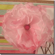
paper-peony-closeupThis month the i {heart} papers design team’s challenge theme is “Going Green” — “green” as in using something reused or recycled on our card or project, with the use of  the color green as an option. OK, more pink than green going on here, but it sings “spring” to me, so I’m happy!

We are also using the sketch challenge that’s going on at Paper Craft Planet this week.sk031310

I looked around my desk area for something that could be recycled into a card element, and my eyes fell upon a few sheets of white tissue paper that had been in a gift box. Now, I don’t know when I got that paper, and I don’t know why I saved it, or why it happened to be sitting right next to my desk, but it seemed like serendipity to me! I could make a tissue paper flower!

So I got out my Nested Peony Nestabilities and cut through several (about 10) layers of the tissue paper. I attached them through the center with a little brad, crumpled them up, airbrushed them with a Copic marker, and got this sweet thing. It reminded me of cherry blossoms, so I pulled out my February Unity Store Kit (which Kate seems to be out of, but I bet she’ll get more if you ask her nicely) and stamped the trees twice in Palette Burnt Umber. I cut it out using one of the Classic Scalloped Rectangle Nestabilities and trimmed three of the sides straight. I matted on a similarly cut piece of pink cardstock. Then I glued some pink Flower Soft onto the trees to make them look like cherry blossoms.spring-trees
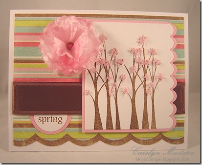
I dug through my stash and found a piece of this striped paper from MME’s Penny Lane collection. It had just the right spring-like colors, and the built-in scalloped edge was the perfect complement to the tree panel.

The ribbon was salvaged from my scrap bag – I must have cut it at some point with the intention of using it on a card and changed my mind. And the “spring” came from one of my favorite little Hero Arts stamp sets, Happy Greetings. It always seems to have just the word I’m looking for, and it’s such a fun little typeface!

Supplies from i {heart} papers:
Stamps: Life is Fabulous (Unity), Happy Greetings (HA)
Ink:
Palette Burnt Umber, Copic marker (R83)
Paper:
"Ballet" Free Flowing Stripes (MME)
Other: Nested Peony & Classic Rectangle
Nestabilities, Soft Baby Pink Flower Soft, Sugar Rush glazed brads

Check out what the rest of the IHP Design Team did with this challenge:

Cathleen
Deb
Gretchen
Kate
Kendra
Loretta
Lori
Lynn
Megan
Tracy

We'd love to see what you create too. Upload your project to an online gallery using the keywords ihp0310 and sk031310, or leave us a link to your blog.

Here’s hoping spring, and those cherry blossoms, come along soon – I’ve had more than enough of winter!

CMsignature