Friday, June 25, 2010

Papertrey June Blog Hop Challenge

bloghoplogo

pti-june-hop

This month's blog hop is all about color, so our challenge is to create a project using our favorite Papertrey color combination. Now, I didn’t realize that this was a favorite combination of mine until I noticed that I had used it in no less than THREE cards recently. And lucky you, you get to see all three of them.

Let’s start with this one. It uses the set Heart Prints. Very simple and classic. I like it. Unfortunately, it wasn’t what Papercrafts magazine was looking for in the last publication call. I still like it.

love-forever

Next up, another pub rejection. You’ll notice a theme here with 1/4” strips. Everyone who makes layered cards has 1/4” strips laying around. You know you do. Here’s a really cool way to use them. These are some extra butterflies I had left from making this card.

blocked-butterfly

The third card is one I made a little while ago. I don’t think I posted it yet. Signature Greetings again, and Delightful Dahlia. That’s some black Sparkly Fluff in the center of the flower.

fabulous-dahliaHope you enjoyed the cards and can get some inspiration from my color combination. 

CMsignature

Tuesday, June 22, 2010

Blast From the Past Blog Hop

I’m excited to be participating in Taylored Expressions’ Blast From the Past customer bog hop. I realized that I haven’t given my TE stamps enough love lately, so this was a great opportunity to play with them. Here’s my card, using the set Doctor’s Orders.

TEoldies-bloghop
I used papers from the Cosmo Cricket Early Bird collection for the background and the paper-pieced bedspread. The colors kinda fit the optional color inspiration that was included with the blog hop rules:

BFTPInspiration

I didn’t want to add another layer behind the focal image since the background was so busy already, but it needed some definition so I just ran a red Copic marker around the edges of the ovals. And of course I had to add a little bling in the form of red rhinestones.

Here are the entries from the Taylored Expressions Blast from the Past blog hop! Stay tuned for details on how you can sign up for the customer blog hop next month!

1. Taylor VanBruggen  19. Alison Anderson  37. Libby Hickson 
2. Monika Davis  20. Jessica Willison  38. Rebecca Ednie 
3. Jen Tapler  21. JoAnn Valderama  39. Peggy McCurry 
4. Tracy Clemente  22. Cassie Trask  40. Tonya Woodruff-Everett 
5. Carolina Buchting  23. Margaret de Witt  41. Barbara Anders 
6. Jackie Pedro  24. Karen Motz  42. Jami Sibley 
7. Corinne Reyes Mercado  25. Candace Mitchell  43. Pattie Goldman 
8. Margie Cortina  26. Shelly Cameron  44. Angela Bear 
9. Bonnie Ratzloff  27. Charmaine Ikach  45. Carole Chesser 
10. Tangii Crain  28. Karen Giron  46. Ayana Posadas 
11. Jodi Collins  29. Laurie Schmidlin  47. Lisa Smeaton 
12. Stacey Schafer  30. Tammy Hershberger  48. Colleen Begley  
13. Kerry Johnson  31. Lorie Ames  49. Lori Tecler 
14. Tanis Palmer  32. Ann Kranitz  50. Rosie Hughes 
15. Kelli Hull  33. Carolyn Mustopa  51. Sankari Wegman 
16. Nancy McKinney  34. Melissa Cooper  52. Meri McLaughlin 
17. Lisa Hjulberg  35. Laura Jean Nygaard  53. Melissa Sauls 
18. Stephanie Kraft  36. Patti Gingrich 

(Collection closed)
Link tool by inlinkz.com

CMsignature

Sunday, June 20, 2010

For an Inspiring Graduate

I may have mentioned that I work at a college. I come in contact with all kinds of students on a daily basis, but I have had the privilege of becoming friendly with one who really stands out. Lorinda is no spring chicken; I know she has a grown son. She has battled almost every kind of challenge, health and otherwise, that you can think of, including two bouts with cancer. Yet she has the most positive, infectiously joyous attitude of anyone I have ever met. She’s an inspiration to everyone she meets. She is my biggest cheerleader in my weight loss journey, swearing she sees changes that even I can’t see.

And she is graduating today – magna cum laude.

lorinda-graduationThis card is simple, but it says everything it needs to say, and it sparkles – just like she does.

The cap is from the set For the Graduate, and the sentiment from Signature Greetings, both by Papertrey Ink. The trailing rhinestones are a piece of a Zva Creative flourish from i {heart} papers. There’s another rhinestone in the center of the cap. I cut the panel a little smaller than the card front and scored it 1/4” on all sides with my Scor-it board.

I’m so proud of her huge accomplishment – even prouder that she’s going on for her Master’s degree in the fall. I wish her all the happiness in the world. But I’m really gonna miss her…

CMsignature

Tuesday, June 15, 2010

IHP June DT Challenge: Getting “Krafty”

[BE SURE TO READ ALL THE WAY THROUGH TO SEE SOME EXCITING NEWS!]

The challenge this month was to use one of the Kraft patterned papers that Kate has in the store. There are plenty of them, and I decided to use the Life Stories Collection 2 Pack by My Mind’s Eye. Pretty roses, huh?
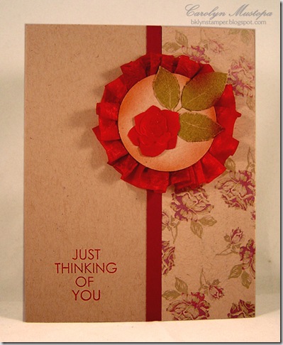
IHPjuneDTWell, you might have noticed that I don’t use Kraft very often. And oh brother (sister), did I ever struggle with this challenge! I played around with an idea I had for 2 weeks and couldn’t make it work. Finally, I had to just toss it and start over again. I used the FTL#94 from Clean & Simple Stamping for my layout.

The focal piece is actually the back of one of the tags that comes with the collection. I messed up the front. Yeah, this was THAT kind of card. I stamped the rose leaves from the Hero Arts set Leaf Prints on the tag, and also on a scrap piece of Kraft paper, with Ripe Avocado ink. I cut the leaves out of the scrap piece and glued them onto the tag. The rose is from an ooooold package of Martha Stewart stickers that have been sitting in my stash for about a century. It was pink, and I airbrushed it burgundy with one of my Copic markers.

I took a length of red crepe ribbon and sprayed it with a brownish Copic marker to bring it a little closer to the color in the paper. Then I ruffled it behind the circle and sprayed some of the same brownish color around the edge to “dirty it up” a little. I don’t know why. It seemed like a good idea at the time.

The greeting is from the Mint Motif set Very Square Sentiments, available only from i {heart} papers.

And speaking of stamps available exclusively from i {heart} papers (here comes the big news), tomorrow begins sneak peeks of the latest Petal Press set called Summer Garden. The Petal Press is BACK (after a brief hiatus) and this new set is the perfect summer set! It’s sweet and elegant and even coordinates with some elements from Happy Harvest! 

With the new release comes some new DT faces. They will all have sneak peek samples tomorrow and there will be blog candy up for grabs, so be sure to stop by and comment on all of their blogs for your multiple chances to win, both tomorrow and on release day, June 23.

Please join me in welcoming (or welcoming back) the team. I hope you stop by tomorrow to see their amazing creations!  (Note: Tracy will have projects posted all week long leading up to the release.)

The Petal Press Design Team:
Amy
Cathleen
Gretchen
Heidi
Julie
Krysten
Natalie
Tiffany
Tracy – designer
Kate

Now go check out the rest of the “regular” IHP Design Team and see how much better they met this challenge than I did:

Cathleen
Deb
Gretchen
Kendra
Loretta
Lori
Lynn
Megan
Tracy (yes, she’s a busy girl!)
Kate

If you read this far, you deserve a prize. Unfortunately, I don’t have one. But if you read this far, you also know how and where you can try for one.    :-)

CMsignature

Monday, May 31, 2010

CASEing Cathleen (yet again)

When I feel like creating but feel low on creativity, I head to the many blogs I follow for inspiration. So today I went to my Google Reader  -- a blessing for simplifying my life, as I follow over 250 blogs at this moment -- and selected just the entries that I had “starred” to find something to CASE. Lo and behold, I found (not a surprise) this card by my wonderful and amazingly talented friend Cathleen. She is so often a source of inspiration to me that I should know to just go straight to her blog!

I loved the simplicity and serenity of her card, and of course the butterflies. And I remembered that I had in my stash, from many years ago, a little pack of Japanese washi papers that would work beautifully with this idea. You can’t really tell from the photo, but the centers of the flowers are metallic gold. It’s just gorgeous, and I only had one 6x6 piece of it.

japanese-butterfles Allow me, if you will, to share a few tips I used when making this card.

1) When the paper you’re using is expensive and in short supply, use this trick: cut your layers first, then punch or die-cut your shapes from the part that will be hidden behind another layer. That’s what I did with the butterflies and the large panel.

2) This washi paper is very porous, and its surface does not take well to tape-runner adhesives. Remember the mulberry paper that was so popular several years ago? Like that. So I used Mono Multi liquid adhesive. Worked like a charm.

3) I didn’t want to worry about my greeting having to span different thicknesses of layers that would have been caused by layering the large panel over the smaller one. I trimmed the small layer along the left edge so it could just butt up against the large layer. Voila! – one level surface.

What I used:
Stamps: greeting from Delightful Dahlia (
PTI)
Ink: Memento black
Paper: Japanese washi paper,
PTI white, black, and Spring Moss
Other: butterfly embossing Sizzlet (SU!),
self-adhesive pearl lines (Zva Creative)

Hope all of you here in the U.S. enjoyed your 3-day weekend! Back to the grind tomorrow…

CMsignature

Sunday, May 30, 2010

Happy Birthday, Sis!

lilyofvalley-suz10 Today is my “baby” sister’s birthday, and what a beautiful day it was! The weather here in the northeast is just gorgeous – a little on the hot side, but not oppressively so.

We celebrated with a scrumptious buffet brunch at this awesome place in Westchester called Kittle House, courtesy of my dad and stepmom. 

And because no occasion is complete without cake, I made some cupcakes. suzanne-roseThese are chocolate cupcakes, topped with a double dip of chocolate ganache and little fondant rosebuds. But the surprise is that there’s a mini Reese’s peanut butter cup in the center of the cupcake! Yup, I baked ‘em right in. I put them in the freezer first, and then pressed them gently into the top of the batter before sticking the pan in the oven. The part of the candy that didn’t get completely swallowed up by the batter is nicely hidden by the topping. What a happy little experiment that was! Although I confess that I haven’t tried one yet. I hope the cake isn’t too dry – I never used this particular recipe before.

Oh, if you’re wondering about the card, I used PTI’s Lily of the Valley set, copying Nichole’s idea of stamping on kraft and filling in with white craft ink. I found that using q-tips like she did didnt’ give me enough control, though. I had a few Fantastix laying around since forever, and that worked much better for me. The leaves are colored with Copic Markers YG95 and YG97. The butterflies (of course there had to be butterflies!) are punched out of one of the patterns in Pink Paislee’s Bayberry Cottage pad. It was a little too bright for the background, so I toned it down with a W3 Copic. Tiny rhinestones adorn them. Of course.

Hmmm. I think I have enough WW points left for a cupcake. Happy Birthday, sweet sister! This year has GOT to be better than the last!

CMsignature

Wednesday, May 26, 2010

Color Throwdown #94

Today’s Color Throwdown Challenge is being sponsored by Kate at i {heart} papers, so I’m using a Chicken Girl Designs digital image that is available exclusively through IHP. cgd-ctd-5-26

CTDswatch 94These were a lot of colors to play with, but I think I made it work.

This adorable giraffe image is from the April digital release, and it’s colored with Copic markers (E25, E42, YR18, Y23, YG95, BG10) and cut out with oval Nestabilities. The sentiment is from the CGD photopolymer set Into the Forest. The patterned paper is from PTI Polka Dot Parade pad, and it has 3 of the colors in the challenge. I feel like I should have added something to the yellow panel, but nothing I could think of was working. Oh well.

The other thing that’s bother me is that I used a sketch challenge for this too, and I can’t remember for the life of me which one it was. The ONE time I just follow from my iPod Touch and don’t print it out, I completely lose the reference! The actual sketch used a circle instead of an oval, but otherwise I stayed true to the sketch. If anyone recognizes it, please let me know so I can give credit where it’s due.

Feel free to play along!

CMsignature

Monday, May 24, 2010

Happy Birthday, Daddy-o!

DSC00981Today is my sweet Daddy-o’s birthday. He truly appreciates the cards I make. He’s an engineer, so he looks really closely at them to try to figure out how I did everything, and then when he sees me he asks for details! So every card I make for him, I try to make a little better than the last. Oh, the pressure!!!

Anyhow, making masculine cards is always incredibly difficult for me, so gender-neutral is usually about the best I can do. I was itching to use my new Up, Up and Away set from PTI, and this was the perfect occasion. I LOVED the way Maile Belles used the negative space for the clouds, so I took her idea and raised it by one layer. I wanted to use felt for the top layer of clouds, but I didn’t have any – I did, however, have some white fun foam. I absolutely love how it this card came out!

dadBD10 Sorry if the photo looks a little washed out. I had to take the picture quickly and get it into the mail! I hope he got it today.

I paper-pieced the balloons, and punched the border, from papers in the s.e.i. Jocelyn pad. The greeting is from the PTI set Signature Greetings.

Hope YOUR day is fabulous!

CMsignature

Thursday, May 20, 2010

Many Thanks

delovely-TYset

When I got my box of goodies from Kate at i {heart} papers this week, one of the things I couldn’t wait to play with was the new Cosmo Cricket DeLovely papers. The bright, summery colors and clean designs were just what I needed.

I’ve noticed crafters using their Cricut cutters to cut out words for their cards and scrapbook pages. While this is very cool, I do not own a Cricut, and probably never will. (I know, shocker – a toy I don’t have and don’t think I even need.) But I seemed to remember that one of the alphabet sets (I think it’s called Olivia) that I bought for my Cuttlebug way back when I first got it, had a few words in it. So I dug it out and sure enough, there was “thanks”. Perfect! I would make a set of bright and cheery thank you cards with my new papers. The nice thing about using the die-cut words is that they have enough substance to stand out on even the brightest, busiest papers, as you can see here.

Since I could get 2 cards out of each 6x6 sheet of paper, I made a set of 6. I changed up the layouts a bit for the different papers. Just because I could. Here are pictures of the individual cards, in case you want to see better:

delovelyTYfloral

delovelyTYpink 

delovelyTYyellow

Of course, I had to add some butterflies. I’m hopelessly addicted to butterflies these days! And of course the butterflies needed some bling. I had some Hero Arts rhinestones that came with 4 colors in the pack. I used the fuchsia ones on the bottom card, but for the others I used my black Copic marker to color some clear ones. I love being able to do that – have perfectly matching accents in seconds!

The stamped greetings all come from the OCL set Big Thanks. And the strips are not ribbon – just 1/4” strips of cardstock.

OK, I have the day off again today, so I’m gonna try and take a little walk on this gorgeous day, and maybe make something to show you tomorrow. Have a wonderful day, and thanks for stopping by!

CMsignature

Wednesday, May 19, 2010

Shabby Chic Baby Girl

I would tend to describe my papercrafting style as clean & simple, so shabby chic is not something I’ve ever felt comfortable with. Which is why the Shabby Chic CAS Challenge on Splitcoast Stampers kind of scared me. But I had this beautiful Memory Box Gossamer paper from i {heart} papers, and it seemed like a great way to use it. I also took the opportunity to use the Paper Crafts Go-To Sketch Challenge #3 to make this card. Nothing like compound challenges to get the mojo going!

GTSC3-babygirl

I must say, I kinda like the way it came out. But don’t expect to see a lot of sponging or {shudder} distressing from me!

CMsignature

What I used:
Stamps: Baby Button Bits (
PTI)
Ink: Creamy Caramel, Memento Rich Cocoa
Paper: Memory Box Gossamer,
PTI White and Sweet Blush
Other: Vintage Buttons (
PTI), 1” circle punch

Tuesday, May 18, 2010

IHP May Challenge: CASEing Kimberly

As you may be aware, the uber-talented Kimberly Crawford just came out with her own line of photopolymer stamps called Mint Motif, available exclusively through i {heart} papers. To pay homage to this exciting and remarkable achievement, the IHP Design Team was challenged to select one of the many awesome cards on her blog and use it as inspiration for our own.

Now, what I realized when I sat down to tackle this is that the real challenge was picking just one! It soon became clear that a huge percentage of the cards I have been inspired by, whether in blogs or in magazines, have been created by Kimberly. Since I don’t have her new stamps yet (waiting not-so-patiently for mine to come in the mail) I finally settled on this one, from back in March. I loved how she combined the two patterned papers (I do love my patterned papers!), and I love having a way to showcase a special embellishment.

IHPmayDT For my card, I used papers from the BG Green at Heart 6x6 pad, and one of the pretty ivory tulle butterflies from IHP. I used a Copic marker (V04) to color it to match the paper. I airbrushed the sentiment panel with YG21 and YG23 while it was still in the rectangle Nestabilities to pick up the greens in the paper as well.

Please go check out the rest of the design team to see what inspiration they’ve gleaned from Kimberly’s creativity. 

If you’d like to play along and CASE one of Kimberly’s cards too, please let us know. If you post it to one of the online galleries, you can use the keyword ihp0510 so we can find it.

What I used:
Stamps:
All Occasions Messages (Hero Arts)
Ink: Plum Pudding (
PTI), Copic markers V04, YG21, YG23
Paper:
PTI White, BG Green at Heart 
Other: Rectangle & Labels Two
Nestabilities, tulle butterfly, linen thread 

CMsignature

Sunday, May 16, 2010

Yay, Cathleen!

My friend and fellow IHP Design Team member, Cathleen Torina, is this week’s Featured Stamper over at Splitcoast Stampers. I’m over-the-moon thrilled for her, and she SO deserves it!

The deal is that you pick one of the many amazing cards in her gallery and find one to do over your own way. I think you’re supposed to use a different image, but since I have the image she used on this card, and I’ve had a hard time using it, I figured I’d use her same basic layout (‘cause I loved it so much!) and just change the colors up. I also didn’t use quite as many layers or details as she did.

ctorina-case

What I used:
Stamps:
Thank You (cling - Hero Arts)
Ink: Memento Black,
Copic markers RV06, YG25
Paper: White, 2008 Bitty Dot Basics (
PTI)
Other: Buttons and ribbon from
PTI, Big Scalloped Petite Borderabilties

I hope you’ll go over and take a look at all of Cathleen’s gorgeous work – she’ll inspire you the way she does me!

CMsignature

Saturday, May 15, 2010

Fairy Door

Up until last weekend, I had barely heard of Fairy Doors and certainly had never seen one. But I was in Ann Arbor last weekend visiting my son and daughter-in-law for Mother’s Day, and as we were walking along S. Main Street my DIL pulled us aside to show us this magical sight:

fairy-door

Teeny-tiny. I don’t think it was more than a foot high! And absolutely perfect in every way.

I believe in fairies.

CMsignature

Monday, May 10, 2010

Bring on the Cake

Today i {heart} papers is releasing a new batch of Chicken Girl goodness! The May release of the Chicken Girl Designs digital stamps has such fun images that I couldn’t resist pitching in to help introduce them.

cgd-kittycake1 This is the Kitty Cake image, one of four being released today. The words are from the Hero Arts set Essential Messages. I just cut them apart and matted them for emphasis. The patterned paper is from the Basic Grey Kioshi 6x6 pad. I ruffled some white silk ribbon behind the focal image using i {stick} papers redline tape. As you can see, I didn’t do a perfect job of it, but I’m learning to forgive myself.

OK, here’s the full May CGD release. Tell me, how can you possibly resist these?!!

maydigicollectionGo check out what the Chicken Girl Design Team did with them:

Christy
Loretta
Lori
Tammy
Carlie
Michele
Laura
Kate

And I wouldn’t be surprised if some of the other i {heart} papers design team members have something to show you too.

Now isn’t this a great way to start off the week?

CMsignature

Friday, May 7, 2010

Mint Motif at IHP

Today is a very special day at i {heart} papers! Yes, of course it’s Friday, but today also begins the sneak peeks for IHP’s newest exclusive stamp line, Mint Motif, designed by Kimberly Crawford. Over the coming week you will see peeks of the two coordinating sets, Very Square and Very Square Sentiments, which will be fully released on the 14th. I’m so excited for Kim, and I can’t wait to get my hands on my own set!

So do you want to see the peeks? Go check out Mint Motif’s fabulous design team:

mmdt 


Kimberly Crawford – designer
Charlene Austin
Latisha Yoast
Geny Cassady
Kazan Clark
Julie Overby
Kate – owner

Have a great weekend!

CMsignature