Friday, September 25, 2009

A clearly boo-tiful day!

Ever since I saw this week’s awesome Fall-to Layout #60 sketch on the Clean & Simple blog, I’ve had this card brewing in my head. Tonight I finally got a chance to make it happen.

I love these adorable ghosts in the new Silly Monsters set by Chicken Girl Design. And what better card base to use on a ghost card than clear acetate? boo-tiful-day1 You can’t tell from the picture, but the ghosts are painted with Candle Light Shimmerz. Adds a nice effect. I wanted to try to stamp a reverse of the ghost to add a third one on the upper right, but I didn’t want to take the chance of messing it up!

What I used:
Stamps:
Silly Monsters (available only at i {heart} papers)
Ink:
Palette Noir
Paper: clear acetate, Eerie (Basic Grey), SU! white and pumpkin pie
Other:
Zva pearl lines, Candle Light Shimmerz

It’s Friday! Hope you all have a boo-tiful day!

CMsignature

Wednesday, September 23, 2009

Cheer up!

rooco-flowers1Wouldn’t this adorable raccoon lift your spirits? I wanted to make an easy-to-mail card with no “bumps” and this is what I came up with. Others have had Rooco the raccoon carrying various things above his head, like a pumpkin, but I wanted something non-seasonal. I had Tracy’s new set, Happy Harvest, on my table and saw that one of the pieces from that set would fit perfectly!

I colored the image with my Copic markers, and then did a little freehand doodling around the edge, ‘cause it just needed something! Oh, and I also used some Sunshiny Yellow Fun Flock on the centers of the daisies to give the card a little bit of dimension.

Incidentally, I just have to say that Stampendous has a terrific product here with these ClingRubber stamps. You get all the advantages of an unmounted, foam-backed rubber stamp (superb impression and easy storage) along with the ability to see exactly where you’re stamping, since the image of the stamp is printed right on back, which clings to your acrylic block. And (shameless plug here) Kate has a bunch of them, including this Rooco Reach, at i {heart} papers. Just do a search for “rooco” on the site.

Hope your spirits are high!

CMsignature

Friday, September 18, 2009

Lookie what my Dad made me!!!

One day last month, during a slow day at work, I was pondering how I was ever going to make my 1 bedroom apartment presentable again, what with the incredibly large and growing collection of paper crafting supplies I've accumulated in the last several years. It is completely taking over my living/dining room! I sketched out an idea for a ribbon storage rack and sent my dad, who is fond of building things, an e-mail describing my concept and asking if he would build it for me. After discussing measurements, my sweet daddy-o said he'd "work it up in CAD" (it's nice to have a dad who's a retired engineer!), and a couple of weeks later he had this fabulous piece ready for me. I painted it last weekend, and finally got it hung today. Isn't it awesome?!!! (For some reason the camera lens made it look like it was not perfectly squared, but believe me, it is!)

While my SU! ribbons are, for the most part, neatly stored away in SU! ribbon keepers, my collection of Papertrey Ink ribbons was getting way out of hand. I also needed someplace to keep my ever-expanding collection of PTI stamp sets. This unit is 2' wide by 3' high, and it's appalling to me that it's already almost filled up! I still have a big drawer full of miscellaneous ribbons that I don't dare put in here for fear of not having room for whatever new colors PTI comes out with.

I really need get a handle on storing all my stuff. I think it's time for me to start getting rid of some of the stuff that I've never even used and am not likely to use {shudder}. I might even give some of it away as blog candy, since my first blogaversary is coming up next month. Hmmmm...that might be fun! What do you think?

Tuesday, September 15, 2009

September IHP Challenge: Large Scale Prints

This month the i {heart} papers Design Team challenge was to use a piece of large-scale printed paper in a card, which can be a challenge in the best of cases. Kate then threw in a little twist: she sent every member of the design team the SAME piece of large-scale paper and the SAME piece of ribbon to see how we would each use them. Personally, I can’t wait to see what the rest of the DT did!

The paper she sent us was from the Webster’s Pages Raspberry Truffles collection. It’s appropriately called Delish. I decided to do some fussy-cutting to make use of the big, bold flowers in one corner of the paper, and this is what I came up with:

sept-ihp-challenge The ribbon is a beautiful, light fuchsia faux suede, and I used my Bow Easy to make that purty bow (it’s just tacked on with a glue dot).

I jazzed it up a little with some bling. The pink stones on the large flower are from one of my Hero Arts Sparkle Clear stamp sets (can’t remember which one), and the clear bling on the smaller flowers is from Hero Arts as well.

For the greeting, I did the unthinkable – I actually cut apart one of my clear stamps so I could get the phrase on 2 lines instead of 1. Under other circumstances, I might have just inked the sections separately, but since I was using goopy pigment ink, I knew I’d make a mess that way. And to be honest, I have LOTS of “thinking of you” stamps in my stash, including at least 2 more in that very set, Everyday Sayings (also from Hero Arts).

Obviously, every product I’ve mentioned so far is available at i {heart} papers (as if the links didn’t tip you off!). My cardstock was PTI Dark Chocolate, Raspberry Fizz, and Vintage Cream. (OMG, that sounds delicious!)

Well, I’m gonna go hop around to the rest of the Design Team to see what they did, and I hope you will too! Here — this’ll make it easy for you:

Amber (So Many Colors, So Little Time)
Cathleen (Crooked Card Creations)
Deb (With a Stamp and a Song)
Gretchen (Happiness Is. . .)
Kate (i {heart} papers)
Kendra (Kendra's Card Company)
Lynn (Stamperosity)
Megan (Megan Lock Designs)
Tracy (Who IsTracy?)

And if you’d like to show us how YOU use large patterns in your cards, feel free to leave a comment and link on one of our blogs. We’d love to see!

CMsignature

Wednesday, September 9, 2009

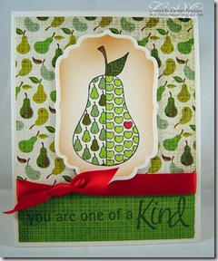
Honey, could you pare a pair of pears?

What a funny language we have — so many words that sound exactly the same, but are spelled differently and have completely different meanings. But that’s neither here (hear) nor there (their). unity-pear2

Anyway, enough linguistics. You’re here for the pictures, right? So here are a pair of pears. But not just any pears — these are very special apple-pears by Unity. This stamp is from the August Unity Store Kit, which is still available at i {heart} papers, even though the new September kit is on its way.pantry-pear

For the first card, I colored it to match the gorgeous paper in the new Cosmo Cricket Early Bird Mini-Deck. The greeting is from All Occasions Messages. The little apples in the corner are made with a tiny punch I picked up at the Target dollar spot about a year ago, maybe more. You can’t see it well in the photo, but the little punched apples have their stems colored brown, and they are covered with Ranger Glossy Accents, as is the lone green apple inside the pear. And look, Ma — no airbrushing or ribbon!

The second card uses a piece of the upcoming Basic Grey Nook & Pantry collection, which will be available at i {heart} papers as soon as it ships from Basic Grey some time this fall. This was a sample piece we got at CHA, so I’m teasing you with it. The green is the reverse of the pear side. On this card I used the sentiment stamp that comes with the Unity August Store Kit. And yeah, here we have airbrushing and ribbon. Can’t go too long without it.

For both cards, I colored with Copics and used my Nestabilities to cut the images. What on earth did we ever do before Copics and Nestabilities?

CMsignature

Tuesday, September 8, 2009

Big News at i {heart} papers!

Not only will they be releasing two more sets from their new line of Chicken Girl Stamps this month but they are introducing a new design line called The Petal Press, designed by our very own DT Coordinator, Tracy Schultz. I love her style and I’m sure you will too. It is very different from the CGD sets, so if cute bugs and animals aren’t your style (and even if they are!), maybe The Petal Press will float your boat. See, there’s something for everybody!

It’s going to be a busy next few weeks, with sneak peeks of all three new sets beginning tomorrow and running through September 15. The full releases will be on September 16 so be sure to check the i {heart} papers blog every day for some samples.

And, of course, with a new stamp line comes some new DT additions. Please join us in welcoming some new faces (and a couple of familiar ones who are also helping out!)

petalpressDT
Ashley Cannon Newell
Carly Robertson
Cathleen Torina
Gretchen Belknap
Jenyfur Pohl
Julie Lacey
Krysten Ng
Tiffany Johnson
Tracy Schultz – designer
Kate Baldwin – owner

Check their blogs often, especially over the next few weeks, to see what we’re so excited about!

CMsignature

Saturday, September 5, 2009

RU Square?

OK, lame title for a blog post. I just couldn’t come up with anything catchy to use for the theme of this, whautumn-pitcher-BDich is using 4” squares of patterned paper for an easy layout. I was inspired by Michelle Wooderson and her blog Mish Mash. Long ago she posted about how she likes to cut her 12” papers up into 4” squares to use variations of this layout, and I find I fall back on it often. Here are 2 cards I made last weekend using it.

 bloom-cupcake-BDAs I’m sure I’ve mentioned, I love coloring, and sometimes I sit and color images just to relax. If I’m smart, I pick a piece of patterned paper FIRST, so I can pull my colors for the image from the paper. Many times I have been stuck looking at a colored image and realizing I have NO matching paper for it!


What I used:
(top card)
Stamps: PTI Autumn Abundance & Floral Fusion
Ink: Memento Black, Copic markers
Paper: PTI White, Basic Grey
Marrakech pad
Other: SU! ribbon,
Nestabilities

(bottom card)
Stamps: Unity August KOM, PTI Floral Fusion
Ink: Memento Black, Copic markers
Paper: PTI White,
MME Bloom collection
Other: PTI ribbon, Liquid Pearls, Nestabilities, clear adhesive rhinestones

Both of these cards went out to birthday girls this week. Hope they enjoyed them!

CMsignature