Sunday, August 25, 2013

Ah, to be so easily entertained…

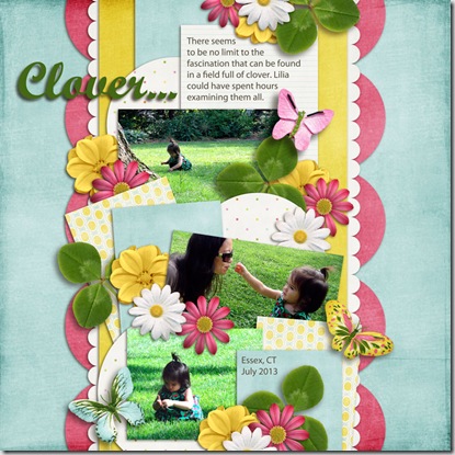
These pictures were taken on a day trip to Essex, CT in July. Lovely little town, and we really lucked out with the weather, since it rained before we got there, and right after we left. There’s a beautiful town green overlooking the Long Island Sound, and Lilia was endlessly fascinated by all the clover growing there.

Lilia-EssexGreenSince I started with the whole digital scrapbooking thing (and even before), I have amassed a huge number of kits and collections, some for free, some not (remind me to tell you how deliriously happy it makes me that digital stuff is so cheap). So it drives me a little nuts when I have an idea for a page and I can’t find all the elements in one kit.

Such was the case with this page. I was using a template, and had a vision of how I wanted it to look, but I had to use 4 different kits to get what I needed. Which means I can’t post the page in the gallery that was hosting the template challenge, because it uses mostly stuff from other stores. Oh well.

Credits: Template by Little Green Frog Designs – Scrap Orchard August Challenge; Papers and butterflies: Live Life Every Day by Lina Dragani (LDrag Designs); flowers from Love Her Forever by Lorilei Murphy (Studio Rosey Posey), and Summer Livin’ collection from Sweet Shoppe Designs; clover from Laugh Lots by Bella Gypsy.

I have mixed feelings about this layout. I kind of feel like the elements overpower the photos, even though I tried to keep the colors minimal and the patterns unobtrusive. I even removed some of the elements from the template. Again, oh well. It’s another memory preserved, and isn’t that what scrapbooking is about?

CMsignature

Sunday, August 11, 2013

It’s not California…

Oh, this is gonna be a rough week for me. My baby (OK, she’s in her 30s, but she’s still my baby) is moving out of NYC. The last one of the three to go. I knew it was coming, but was living quite comfortably in the land of denial. And as she keeps reminding me, it’s only Boston, not California.

Annisa_fly-webI made this page about a month ago, before the news was official. Now everybody knows, and it can go public. Just a note, this is not a very recent photo of her, but it’s one of my favorites and I think it was taken in an airport, which makes it appropriate. And she really doesn’t look any different now. She’s as vibrant and beautiful as the colors on the page.

Oh, this week is gonna be hard. I just have to keep repeating: It’s not California. It’s not California…

Credits: Template from the Going Solo package by Mye De Leon (Pixels & Co.); Paper from Quilted with Love by Janet Scott Design; Ribbons from Break the Pattern by Lauren Grier; Bird from Touch the Sky by Digilicious Designs. I have searched through every folder to track down where I got the alphabet and flowers from, but I can’t find them. I’ll update this as soon as I do.

CMsignature

Sunday, July 28, 2013

Forty years and counting…

I’m back with another digi-page on this cloudy, lazy Sunday. After all, what better way to continue the ongoing project of flattening and broadening my butt than to sit at the computer for a few more hours documenting memories.

This past February (wow, was it 5 months ago?!!) my dad and stepmom celebrated their 40th wedding anniversary. It is such a blessing to see how much they love each other, how they take care of each other, and just how silly they still are with each other after all these years. Aren’t they adorable?

40years-web Credits: Template from Stand Out template pack by Meagan’s Creations; papers & elements from Catching My Breath kit by Down This Road Designs.

While we’re at it, I’m not sure I showed you the cake I made for the occasion. It was my first attempt (and probably my last) at brushstroke embroidery on fondant, so please be kind. I don’t even remember what kind of cake or filling it was.

IMG_1903

OK, I need to get up and move around a little now before my feet fall asleep. Enjoy what’s left of the weekend!

CMsignature

All 4 of us

Just popping in with another digi-page. See, I can scrap something other than my sweet granddaughter!

This was taken up at my dad’s house last month. There are precious few times that the four of us siblings are in the same place any more, but this was one of them. Gotta preserve it for history! (Please note for the record that at 5’7”-ish, I am the shortest of the bunch.)

DAD-4ofUs-web

Credits: Template by Scrapping with Liz; Papers & elements from Daddy-O kit by Sherrie Piegdon/Pixel Gypsy

CMsignature

Sunday, July 21, 2013

It’s hard work staying cool!

At least that’s how my granddaughter makes it look! She’s always so serious about everything, but I’m sure she was having fun in her little yellow bikini!at-the-lake-web

The colors in this layout were inspired by the recent heat wave we experienced here in the northeast. Brutal, I tell ya!

Yes, I really do create layouts with subjects besides this cutie. I did one about my youngest daughter last weekend, but I can’t show it to you yet… Soon.

Supplies: Template is a FB Freebie from Digital Scrapbook Ingredients that coordinates with the Beautiful You kit; Papers and elements are from the Love Me Some Summer collection by Mandy King, available at Gotta Pixel.

Keep cool!

CMsignature

Saturday, June 15, 2013

More of my favorite subject

My daughter-in-law sent me a couple of totally precious shots of Lilia, so this morning I sat down to digi-scrap them. Only this time, I challenged myself to use only the Stampin’ Up papers and embellishments that came with the My Digital Studio software instead of the tons of stuff I have downloaded from other sources.

smell the flowers-001In all fairness, I pretty much completely “scraplifted” the layout from Debbie Hodge

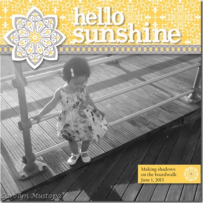
hello sunshine-001This one was heavily inspired by a page by Jean Manis. I loved how she changed the photo to b&w, and used bright colors on the page to tell the story.

I’m having too much fun with this!

CMsignature

Saturday, June 8, 2013

Hard to believe it was a year ago…

My little munchkin granddaughter has grown so fast! This digi-page uses a picture taken of her at 6 months. Papers and elements from the Happy Dance collection by Mandy King, available at Gotta Pixel. Based on a template by Elizabeth Albers.

Lilia-6mos-button

This next one was taken last week at a beach on Long Island. You can’t see her face, but it was such a great picture that I had to use it in a layout. I took the opportunity to try my hand a clipping mask, using a freebie from Jillybean Designs. Paper and elements from the Sea Glass collection by Litabells.

Lilia-Beach-001

I really should step away from the computer now. ‘Til next time…

CMsignature

Sunday, May 5, 2013

More digi-scrapping…

You might say I’m a little behind in my scrapbooking, since the beautiful couple below has just celebrated their 5th wedding anniversary. I don’t look at myself as behind, since I never intended to keep up anyway. I don’t even consider myself a scrapbooker, for that matter.

Nevertheless, today I spent the better part of the day working on this layout.  LR-engaged

I found it in a sketch challenge on My Sketch World. I was captivated by the hexagons, and went search of a great photo to use it with. Maylayout2013

I used MDS to create the page (the digital papers came from there too), but I was delighted to find that not only was I able to use some freebie downloaded embellishments from who-remembers-where, but the program makes it very easy to change the colors of them to suit whatever I’m working with. I have tried digi-scrapping with Photoshop CS and Photoshop Elements, and MDS is by far the easiest and least stressful to deal with. I’ll keep using Photoshop for my image editing, but for scrapping, MDS is IT!

After I saved the page above as a .jpg file, I noticed I had created a page several years ago with a photo from the same engagement shoot. I don’t even really remember doing it.
Laila_Roy-kiss

Anyhow, that’s it for now. I have duly fulfilled my National Scrapbooking Day (weekend) responsibilities.

Later!

CMsignature

Saturday, May 4, 2013

Happy National Scrapbooking Day!

In honor of the occasion, I decided to once again try my hand at digital scrapbooking using some freebie mini-kits I downloaded this morning from Sweet Shoppe Designs. And of course, using my favorite subject, my adorable granddaughter, Lilia.

Lilia-create

I used Stampin’ Up!’s MDS2+ program to make the page, and that digital “create” stamp is from there. The layout, however, was taken from Sketch Challenge #78 on Papertake. I think it was supposed to be a card sketch, but it worked great for a scrapbook page!

I’m happy to say that this digi-scrapping thing is really growing on me, and I’m getting less anxious every time I attempt a page. Yeah, new technology makes me nervous!

Now I think I’ll go out and enjoy some of this beautiful spring weather before I lose the whole day!

CMsignature

Sunday, March 17, 2013

On Creativity

(Be forewarned, this is wordy – but I promise to have some crafty goodness at the end.)

I’ve been thinking a lot about creativity lately. Specifically, what sparks my own creative muse? What does it take to not only inspire me, but to actually move me to create? In this case, I’m talking about cardmaking, but I suppose it applies to all other aspects of my creative life. And maybe yours.

I tried to remember exactly when I felt the most inspired, the most creative, and I realized that back in the very beginning of my papercrafting era, when I was a Stampin’ Up demo about 10 years ago, I used to wake up in the wee hours of the morning with an idea that I wanted to jump out of bed to create. I guess the newness was a part of it then.

I remember looking through magazines and finding cards I loved, and then trying to recreate them using the SU stamps and supplies that I had. There is something to be said for limited supplies and creativity. I got into a nice creative groove, coming up with designs that I could use in workshops and classes.

After a while, when I was no longer affiliated with SU, came design team work, which was exciting and fulfilling, and sometimes nerve-wracking. Being forced to produce on deadline brings about its own form of creativity. The blogosphere had exploded with papercrafting talent, and there was no shortage of inspiration out there. And don’t get me wrong, the demands were not heavy at all. But I felt myself slipping away from creating for the sheer pleasure of it.

And now that I am no longer on a design team, I need to find my way back to creating for the sheer pleasure of it. I confess it’s been a little rough, but I’m working through it, still looking through the 200+ stamping blogs in my Google Reader (don’t get me started on that) and the magazines that I still occasionally buy (I only subscribe to one now).

Today while I was eating my lunch, I flipped through a recent PaperCrafts issue called Stamp It! 3 Ways. I came across a beautiful birthday card on page 27, made by Laura Williams, that used a stamp set I didn’t have, but I suddenly felt the need to try to create it with what I had. It would make a perfect card for my boss’s birthday this week.

And so I’m pleased to present my version of the card, made with a few different PTI sets instead of the Gina K set used by Laura.

ESbirthday13

Hmmmm. Maybe I’m ready to hit a few sketch challenges next. Well, maybe we’ll just start with one...

Have you had any challenges to your creativity that you’d like to share? Any suggestions on overcoming them? I’d love to hear from you.

CMsignature

Sunday, January 27, 2013

Stamp therapy

This weekend I’m using stamping as a means to take my mind off my mouth. Since I had 7 teeth extracted on Thursday, and am now trying to adjust to a mouthful of plastic (interim partial dentures), eating, drinking and talking are not very pleasant activities at the moment. Not so much painful, as very uncomfortable as my tongue tries to figure out where it’s supposed to go without bumping into and rubbing against the foreign objects in my mouth. OK, maybe that was TMI.

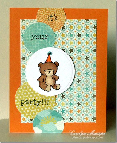
Anyhow, stamping doesn’t use my mouth. Hence, the stamping therapy. I made this last night, but couldn’t photograph it until I could get some sunlight today. This week’s Deconstructed Sketch Challenge #86 looked like fun, but I’m not big on square cards, so here’s my take on it:

party-bear The patterned paper is from an older My Mind’s Eye pad called True Blue from their Fine & Dandy line (or maybe it’s the other way around). The stamps are from 2 different Lawn Fawn sets – the bear is from Pa-Rum-Pa-Pum-Pum (yes, it’s supposed to be a Christmas set, but I’ve used it for everything but that since I’ve had it). I added the party hat with a Copic Multiliner pen and colored it with Copic Markers. The words are from another Lawn Fawn set called Just My Type, Too.

We’ll see what today brings. Maybe more stamping, maybe just curling up on the sofa in front of the TV.

Have a great Sunday!

CMsignature

Saturday, January 26, 2013

Love is in the air…

I’m terrible about remembering anniversaries, and even worse about sending cards for them, but there’s an anniversary coming up that I can’t let go by without acknowledging it – my dad and stepmother will be married 40 years next month! They are the cutest couple, always teasing each other and looking out for each other. She takes such incredibly good care of him, and for that I am most grateful.

Anyhow, I wanted to have a card ready to go, no excuses.

love-owls They are both nature lovers, so the stamp I used was the Owls stamp from the Taylored Expressions Animals in Love series of stamps a la carte, cutting it out and mounting it on a plain white circle. The patterned paper is from the Hopscotch 6x6 pad by Fancy Pants Designs. I ran the dark brown piece of cardstock through my Big Shot with the Woodgrain impression plate from PTI to mimic the tree.SSSC176

I used last week’s Sweet Sunday Sketch Challenge #176 for the  layout. I meant to post this earlier in the week, but extensive dental surgery kinda got in the way. At least I got it photographed and posted before the next Sunday sketch goes up!

Have a great weekend, all!

CMsignature

Tuesday, January 15, 2013

IHP DT January Challenge: Sweetened Tones

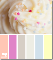
IHPjan13DTThis month our challenge coordinator, Deb, gave us a yummy color inspiration (below) to work with. As you can see above, I took that frosting quite literally. I didn’t get all the colors exactly, and my photography skills don’t quite capture them correctly anyway – in real life the colors are softer. But I’m a sucker for a sweet cupcake, so I couldn’t resist using this Cupcake stamp from Gourmet Rubber Stamps. The cupcake and greeting are all on one stamp, so there’s no fussy aligning to do.

SweetenedTones

I colored it with my Copic markers and went over the sprinkles with various colored Stickles. The image, and the dot-embossed strip, are cut with Nestabilities dies. The image circle is popped up on foam dots. And just to carry the dot theme a little further, I made dots of the same Stickles along the left side of the card.

I can’t wait to see what the rest of the Design Team did with this sweet inspiration. Why don’t you hop along with me and check them out?

Have a sweet day!

CMsignature

Tuesday, December 18, 2012

IHP Design Team December Challenge: Food, Glorious Food!

Since so much about the holidays revolves around food, our challenge this month was to make a food related project. Not so much of a challenge for me. This time of year, food is never far from my thoughts. Or my mouth.

I like to give homemade foodie gifts to the people at work. It’s fun, it’s cheap (usually), and it’s always appreciated. This year I decided to make little jars of dulce de leche (pronounced dool-seh duh laycheh), a devastatingly delicious, thick, caramelized sweetened milk. It can be spread on toast or heated a little and drizzled on pancakes and waffles. You can add it to your coffee or ice cream, or you can fill cookies with it. Or you can eat it with a spoon. Just saying.

dulce_de_leche-group I used half-pint canning jars, decorated simply but beautifully with a tag that rests on the lid and opens for more information.dulce_de_leche-tops To make the tags, I started by cutting a scored and folded piece of cream cardstock with a circle Nestabilities die, leaving the folded edge just inside the die so it wouldn’t cut completely. The inside with the information was computer generated and cut with the same circle die, trimming one edge just a bit to fit inside the fold, and glued in place.

The top of the tag also starts with another cream circle, but it’s decked out for the holidays. The red scalloped ring was made by cutting a scalloped circle the same size as the label, and then using a slightly smaller circle die in the center. Once I adhered that to the cream circle, I stamped the wreath and greeting, which is all on one stamp from the Flourishes Trimmed With Love set, with Memento Tuxedo Black ink. The inside left also uses stamps from that same set. The wreath is colored with Copic markers, glammed up with some red Stickles on the berries, and then that circle is glued onto the top of the folded label. Why use a separate circle for the top instead of just stamping the front of the folded piece? Because the Copic markers are likely to bleed through. If you’re using cardstock that won’t allow that to happen, by all means save yourself a layer and just dress up the folded piece. Once it was all glued together, I just attached it to the jar lid with a couple of mini glue dots.

Wanna make your own dulce de leche? The most common way is to boil an unopened can of sweetened condensed milk, completely submerged, for several hours. That seems a little scary to me. I found an awesome blog post by Monica at The Yummy Life with 2 different ways to make it: one in the oven, and one in a slow cooker. I tried both, and I liked the results in the slow cooker much better (although in all fairness, I used a different brand of milk when I did it in the oven, so that might have had something to do with it). She gives wonderfully illustrated step-by-step instructions, and she even has labels you can print out for gift-giving. I didn’t use her labels, but I did borrow her wording. Thanks, Monica!

12daysdecember Before I send you hopping off to see the rest of the yummy projects from the team, I just wanted to remind you about the 12 Days of Christmas Sale that Kate has been having. Each day a new sale item is posted at a steal of a price. Sale items are valid until sold out or until Christmas Day, whichever comes first! (Sorry, no restocks or rainchecks!) Inventory is low on some items but be sure to join us each day for the IHP 12 Days of Christmas!

Today’s special is all Washi Tape 35% off!

Here’s what we’ve had so far!
12/13 – Stickles/Liquid Pearls $1
12/14 – Scor-Tape 1/8” - $2
12/15 – Spellbinders 35% off
12/16 – BoBunny Flexi-ruler $9
12/17 – Scor-Bug tool $5
12/18 – Washi Tape 35% off

OK, so go shopping. Or go hopping. Or both! Here’s the rest of the gang:

Happy Holidays!

CMsignature

Saturday, December 15, 2012

A couple of holiday cards

Really, I haven’t disappeared off the face of the earth. So many things going on, and I’ve just been physically and otherwise drained by the time I get home from work every day. Weekends are spent catching up and trying to prepare for the holidays.

But I have been doing some card making. Here are a couple (although not the one I’m planning to send out, assuming I actually buy the stamps and get them addressed in time). These are all made with goodies from i {heart} papers, although some may no longer be available by now.

I’ve also been waiting for a sunny day when I could photograph these things. I hate winter hours, and we’ve had more cloudy, rainy days than not lately.

naughty-nice

I made this one a couple of weeks ago (I think), using a sketch challenge that’s probably not current any more. I don’t even remember which one it is, but I liked it. This card uses the Flourishes set Dear Santa, and paper from the Carta Bella pad Winter Fun. There’s a strip of pearls, too, because pearls dress everything up for the holidays. The focal circle is stamped with Memento Rich Cocoa ink and airbrushed with a Copic marker to coordinate with the paper.

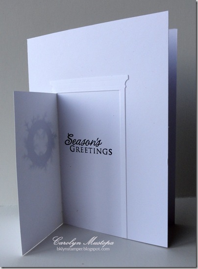
holiday_door-closed This idea has been kicking around in my head for months, and I finally got around to trying it. The door is cut with the Grand Madison Door die by Memory Box. The wreath was made by cutting a base with two nested Nestabilities circle dies, and gluing on punched out branches made with a Martha Stewart punch. Red Stickles finish it off.

And here’s what’s behind the door:holiday_door-open The stamp is from an old Hero Arts set. I suppose I could have dress up the front of the card more, but I kinda like the stark simplicity of it. If I had given myself enough time, it might have been fun to mass-produce these. But I didn’t.

I did want to call your attention to an awesome sale that Kate is having – it’s a 12 Days of Christmas Sale, and there’s a new special every day. You really need to go check it out! The daily special will be listed at the top of the Sale page.12daysdecember

Anyhow, my tree is up now, and I have TONS of cleaning, shopping, baking and other preparations to do in the next week. Oh, and an IHP Design Team challenge to get done this weekend too! Better get crackin’!

CMsignature