Tuesday, July 28, 2009

IHP Challenge: Wide Ribbon (oh, and a contest!)

Now, I love ribbon as much as anyone else. I’ve been accused of being a ribbon junkie (and worse). But wide ribbon has always been a bit of a challenge for me, so when the i {heart} papers Design Team came up with this month’s challenge of using wide ribbon, it struck a little bit of fear into my heart. Until I came up with this:

wide-ribbon-rose-bo

Is that not the most delicious looking ribbon? It’s hard to tell, but the ribbon is satin in the center, and sheer on the edges. This whole card makes me think of chocolate covered cherries (but that’s just my warped mind).

That bow is deceptively simple. It’s really 2 pieces of ribbon. The back one is just a straight piece, notched at the ends. The looped part is just that – a loop of ribbon adhered with a bit of Mono Multi glue. All I did to make the bow was put the loop on top of the notched piece, gather it up in the center with my fingers, and wrapped the 3 wired rose buds around the two pieces to hold them together! Once they are wrapped, it’s very easy to adjust the individual pieces to make them even. The whole thing is attached to the card with a couple of glue dots. How simple is that?!!!

Of course we’d like you to join the challenge with us, but this month we’re stepping it up a bit. Our Challenge Coordinator, Deb Felts, has decided to make a CONTEST out of this month’s challenge. Go to her blog to get all the details. There’s a mighty fine prize involved! And check out the rest of the design team to see who rose to the challenge.

What I used:
Stamps: Flowers For You
Ink: Palette Noir, Copic markers
Paper: Chocolate Chip, Real Red, PTI White
Other: Nestabilities, Cuttlebug embossing folder, 1-1/2” Brown Satin-center ribbon, Wire-stemmed flowers

Saturday, July 25, 2009

Variations on a Theme

I find so much inspiration in the (over 300) blogs that I follow in my Google Reader, and so when I stumbled across this blog entry by Tracy, I couldn’t wait to sit down and make a couple of these cards myself.

topnote-butterfly-wisteria topnote-butterfly-marrakech

They are obviously made the exact same way, using a different assortment of papers and accessories for each. The patterned papers, available at i {heart} papers, are from the Wisteria and Marrakech 6” pads by Basic Grey, respectively. The top card uses some adhesive pearls and a greeting from the Happy Greetings stamp set, and the bottom one some adhesive Zva bling dots.

The Top Note die and butterfly die are from Stampin’ Up!, as is the ribbon, the solid cardstock, and the rub-on I used for the blue card.

These cards are a great way to use up those scraps of patterned paper that I know you have laying around. I cut mine 1-1/4” wide, if you’re interested in trying it yourself. I adhered them to a piece of lightweight cardstock and then ran them through the machine with the die. 6” strips of paper will provide you with enough for 2 of these pieces. Then I trimmed them and adhered them to a solid die-cut shape, and tied it up with a ribbon. There may be another way of doing this, but that’s how I did mine.

Hope your day is full of inspiration!

CMsignature

Saturday, July 18, 2009

Carried Away

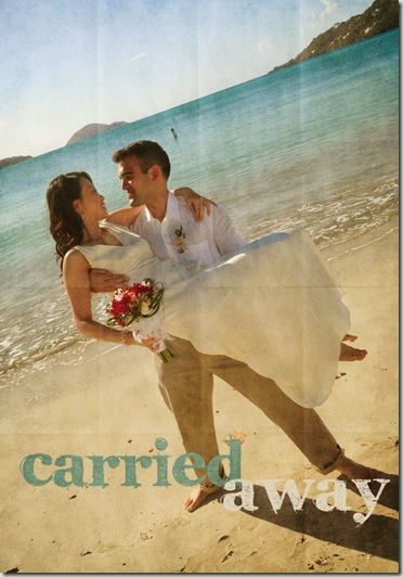
As I mentioned last weekend, I’m taking one of Jessica Sprague’s free online photo editing courses called Frame-Ups and Special Effects. The way she lays out the classes is terrific. This lesson uses textures and text. And as promised, I have a photo from my son’s beach wedding this past Spring. Aren’t they lovely? I just had to share.

carried-away-smallCMsignature

Thursday, July 16, 2009

Happy Birthday, Kate!

Today is my dear friend Kate's birthday, and at this moment she is on her way up to Niagara Falls to celebrate. Since I know she received my card in the mail yesterday, it's safe to show it to you now.
Of course, I wanted to use things she sells in her store for her card, but I HAD to use my beautiful Sweet Pea set (Flourishes) for the image. I chose the paper first, and chose my Copic markers to coordinate. I used some of the lovely embroidered ribbon to center the image on, and I airbrushed some adhesive pearls with one of the Copics to pull it all together. The greeting is from the Happy Greetings set. I've been using that one a LOT lately, and it's on sale right now at i {heart} papers!

Just remember that although you can place your orders at any time, she won't be shipping anything out until she returns on July 23rd.


Sunday, July 12, 2009

More photo editing exercises

I am totally loving working with Photoshop Elements and will have to break down and buy the real thing before my free trial runs out. This pic was an exercise from lesson 5 about using textures. I used a photo I took a few years ago when my sister and I went out to the North Fork of Long Island to visit some wineries. I think it was in October, so the colors weren’t too vibrant anyway, but I took down the saturation a bit to make it look just a little bleaker. There are actually 3 different textures used here. Then I added a mask for the edges, the frame (which is really a brush), and some text, using some of the previous lessons. I love it!

CMsignature

Saturday, July 11, 2009

Fun with Photos

I signed up to take one of Jessica Sprague’s free photo editing classes, which started this past Monday. Unfortunately, I’ve been so busy during the day at work, and so tired when I get home, that I just got to sit down and start the classes this morning. And what I realized is that the versions of Photoshop CS and Photoshop Elements that I have on my computer are too old. Like REALLY old. So I spent the better part of the day fighting with my computer to download a free trial version of Elements 7. But now that that’s done, I am learning so much!

Now, keep in mind that I didn’t actually take either of these photos. The first one, well I don’t even know who took it; the second one was a from a professional engagement photo shoot. But the girls are mine — my two gorgeous daughters.

lesson1-AnnisaB&W

This is my “baby” Annisa, who just turned 29 this week, although the picture was taken a couple of years ago. The photo itself was kinda blurry to begin with, but it’s such a great shot of her, and it totally went with the Word Art that was part of the lesson. This lesson was about using Frames and Word Art.

lesson2-Laila-Roy

This is my other daughter, Laila, and her husband Roy. As I said, this was taken about a year and a half ago for their engagement shoot. This lesson was about using Photoshop Brushes, and I added the text.

Now I need to find a picture of my son and his wife for my next lesson…

CMsignature

Thursday, July 9, 2009

Running a Fever?

This set cracks me up! I know that if I were ever sick, I’d get a kick out of getting a card like this. Fortunately, I don’t know anyone running a fever — but I’m ready!

This card qualifies and Clean & Simple, which is just how I like it these days. A little decorative scoring, a little Glossy Accents on thermometer, and that’s as fancy as it needs to be!

running-fever
What I used:
Stamps:
Running Sick (ON SALE now at i {heart} papers)
Ink:
Palette Noir, Copic markers
Paper: PTI White and Pure Poppy CS
Other: PTI Pure Poppy satin ribbon,
Nestabilities (also ON SALE!), Scor-it, Ranger Glossy Accents 
 CMsignature