This month the i {heart} papers Design Team was challenged to create or alter something organizational. As crafters, we all have lots of I know my table (where normal people would eat, but I craft) is overrun with it. However, my bedroom is also full of stuff. My desk (with my computer) is in there, and my bedside table is always overflowing with books and, well, stuff!
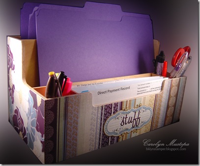
Long ago, in a galaxy far away – oh, wait – different story. Anyway, several years ago I bought a wooden desk organizer at Ikea and have had it on my desk holding various forms of, ummm, stuff. It was a nice, finished wood piece, but I always meant to decorate it. Never did. You know how that goes. Well, now was my chance! I looked through my 12x12 paper collections (this thing is big!) and found the BG Wisteria Collection Pack that I had bought when it first came out. The colors spoke to me. And I realized that they spoke to me because they were the SAME COLORS as my bedroom! And this is what that desk organizer looks like now:
 Forgive the creative Photoshop treatment. The sucker was too big to really fit in my light tent.
I only covered the 4 outer sides. It seemed a waste of time, energy and paper to try to line the insides, which wouldn’t be seen much anyway. The two sides have the same large-scale print, and the back has a different coordinating paper from the collection. You’ll have to trust me on that. I used Royal Coat clear decoupage finish to adhere the paper to the box. I like it much better than Mod Podge. I had to patch the paper on the front and back, because the thing is about 13” wide. That’s kinda why I used the striped paper on the front – makes it harder to see the seam.
But I couldn’t just stop there. I also have a (huge and  growing) collection of Crystal Light containers of all shapes and sizes that I’ve been saving for some kind of organizational purpose. Or something. They begged to be covered with more of this yummy paper. Et voilá! (or is it voilà? – I’m accent-challenged)
These are 2 containers, the newer oval kind, covered and attached to each other with i {heart} papers’ very own i {stick} papers redline tape. Worked like a charm! I trimmed the shorter one in the front a bit so I could grab my reading glasses out of it more easily. When you’re “of a certain age,” you find yourself with multiple pairs of these drugstore beauties strategically placed (lost) all over your house. At least I’ll be able to find one pair!
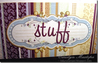
You’ll see that not only did I make use of many of the papers in the collection, but I also used some of the adhesive embellishments (um, stickers) from the pack; the plaque and letters on the box are from the collection. So is the circle border piece on the larger cup. The cute little bee on the shorter cup has some Stardust Stickles on its wings.
I had a lot of fun with this! Hope it gives you some ideas. Oh, and Kate still has (as of the moment of this writing) 2 of the Wisteria Collection Packs in the store. Just sayin’.
Now go check out what the rest of the Design Team did with this challenge:
Cathleen
Deb
Gretchen
Kendra
Loretta
Lori
Lynn
Megan
Tracy
Kate
Enjoy!


