Tuesday, September 18, 2012

Bring on the Bling!

IHP9-12-zvaDo you LOVE bling? So do we! This month the i {heart} papers design team and the team from Zva Creative are celebrating the love of beautiful bling! Since each of our teams have designers who are also Paper Craft Planet Super Novas, we asked the PCP team to host some special challenges throughout the week. There will be lots of beautiful, blingy inspiration!

You should have arrived from Robin Shakoor’s blog...if you missed the beginning, head straight to Kate's blog so you won't miss a single gorgeous project!

ihp_logo i {heart} papers retails the industry's best paper crafting supplies from your favorite manufacturers while offering stellar customer service and super fast and FREE US shipping with any $60 order. (We also ship internationally.) We are proud to offer our exclusive i {stick} papers redline tape, which is manufactured just for us in long-lasting 60 yard rolls, at an amazing price! We also provide a publication incentive for our three private stamp lines, Mint Motif, The Petal Press and Chicken Girl. Visit our website and follow us on Facebook, Twitter and our blog for news, sales, coupons and more!

logoZvaCreative Zva Creative produces many beautiful color groupings of high quality pearls, flowers and crystal embellishments that can be used on scrapbooking, card making and mixed media projects. Visit Zva’s gallery or blog for great project ideas and to find a list of stores and online retailers that sell Zva click HERE.

Zva Creative will be selecting one lucky winner who comments along the blog hop to win a Zva prize package worth $30. All comments must be received by 11:59 pm on Wednesday, September 19th. Winners will be announced on Zva’s blog on Thursday, September 20th.

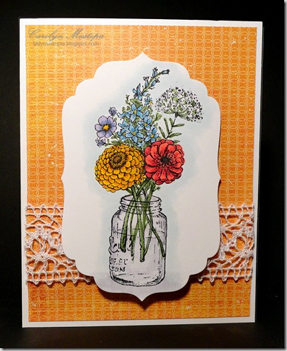
My card above reflects the definite feel of autumn in the air these days. I used the gorgeous Garden Picks set from Flourishes, and paired it up with some fall-colored paper from the Harvest Lane 6x6 pad (Simple Stories). The image, of course, is colored with Copic Markers, and for a little extra oomph on the Queen Anne’s Lace flower, I dotted it with a bit of white Liquid Pearls. The Zva bling I used, the pearl flourish, was originally white, but to tie it in with the colors of the card, I gently swiped over the tops of the pearls with my E55 Copic marker. I love that – you can always have just the right color of bling!

For the layout of my card, I used this week’s Sketch Challenge over at Paper Craft Planet.

From here, you're visiting Andrea Ewen. Thanks for stopping by, and enjoy the hop! We hope to see you and your creations this week on Paper Craft Planet!

CMsignature

Monday, September 17, 2012

Boo!

It’s only the middle of September, but already the stores are full of Halloween stuff. I just got some new goodies from i {heart} papers, and among them were some fun Halloween papers and embellishments, so I couldn’t help getting into the spirit of things! LOL – spirit – get it?

bootiful-day2

This is a re-take on another card I made back in the spring. Yeah, I totally CASEd myself – not sure if that counts as inspiration or laziness.

Anyhow, this card uses paper from the totally adorable Doodlebug Haunted Manor pad, and one of the cute little Mini Doodlepops – Ghosties stickers. The window was cut with the Small Madison Window die and popped up on Dimensional Dots. I sponged a little white ink in the corner for moonlight. The sentiment is from the Chicken Girl Design set Silly Monsters.

In case you’re wondering, the card base is black. I cut away the orange paper so it would show through the window. And you can’t really see it with my inferior photography and photo editing skills, but the chair rail is scored twice on the Scor-Pal to give it a bit of dimension. And yes, the orange paper is a bit “distressed” because I had to pull it off after I mis-aligned it when I was adhering it the first time. And the second time. Let’s just say it adds a little character.

I am thoroughly enjoying my Monday off (and will also enjoy my Tuesday off tomorrow) by indulging in a little extra crafting time. Hope you find something fun to do today, too!

CMsignature

Sunday, September 9, 2012

Summer Strawberries

I know, two posts in one day – go figure. I should have my blogging license revoked, because I sure don’t follow the rules! It seems it’s either feast or famine with me.

Today we’re feasting -- on strawberries. Speaking of which, I will share an embarrassing little secret: There was a summer day, very long ago when my kids were small, that I dropped them all off with a friend so I could indulge in a basket of strawberries all by myself, no sharing! Shameful, huh?

flourishes-strawberries1When I saw the Flourishes Any Which Way Sketch Challenge this week, I couldn't wait to pull out my Strawberries set and get to work on it. Technically, it is still summer, and I’m not letting go of it too easily. There are still strawberries at the fruit store. OK, with today’s global shipping they’re there all year, but still… 

The image is colored with Copic markers (duh), matted on Garden Green cardstock, and popped up on foam dots. I punched a hole on the left side to thread some red herringbone twill ribbon through and tied a bow (haven’t done that in a while!). The card base is covered with red gingham paper from the Simple Stories Summer Fresh pad, and a strip of blue calico print paper (from the same pad) finishes it off. Very summer-in-the-country looking, huh?

I love me some Flourishes stamps when I feel like coloring (which is almost all the time), and I’m so glad that Kate is now carrying them at i {heart} papers.

And I think I’m gonna head out to the fruit store right now!

CMsignature

Sunflowers

On vacation this summer, while taking a bus tour through  Romania on the way to the Danube Delta, we passed several seemingly endless fields of sunflowers. Apparently sunflower oil is one of their major products. Anyway, when I recently got the coordinating dies to the PTI Autumn Abundance set, I couldn’t wait to pull out the sunflower image and play with it. And this week’s Sweet Sunday Sketch Challenge was just the way to use it.

sunflowers1 The blue printed papers are from the Teresa Collins Every Day Moments pad, and the golden print is from Studio Calico’s Memoir pad. The greeting is from the PTI Communique Curves Sentiments set. The white self-adhesive lace trim finishes it off perfectly. And of course, the image is colored with Copic markers.

Here’s another one I made last week using the same image (I cut and colored both at the same time).

sunflowers2 I know I used another card or sketch as inspiration for this one, but darned if I can remember where I saw it! If I find it, I’ll be sure and come back to give credit. Anyhow, same golden paper from the Studio Calico’s Memoir pad. The greeting, I’m pretty sure, is from another PTI set, and the satin ribbon is also PTI. I really need to tack those ribbon strips down so they stay in place!

Enjoy your Sunday!

CMsignature

Tuesday, August 21, 2012

August IHP Design Team Challenge: Inspired by…

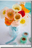
This month’s i {heart} papers Design Team challenge was create something inspired by this lovely photo.august DT inspiration These corals and oranges seem to be very popular for the coming season.

I decided to use these colors to design a scrapbook page about my favorite subject: my sweet little granddaughter, Lilia. Fortunately, my son and daughter-in-law keep me well supplied with pictures, and this little triptych is among my current favorites.

IHPaug12dt It was VERY hard to get a good picture of this page. My scanner does not handle 12x12, and just about every photo I took showed either glare or shadow.

All of the patterned papers I used were from the Tangerine 6x6 pad from My Mind’s Eye – even the little word pieces are cut from one of the papers. It’s part of their The Sweetest Thing line, and it’s just gorgeous! I die-cut the letters from the paper, too.  I used two strips of 5/8” pink twill ribbon along the top of the bottom strip.

Those of you with a keen eye will notice that I used 6x6 paper on a 12x12 page. Yeah, that was a bit of a challenge in itself, and I can’t say I’m thrilled with the results. The seams are not invisible, and even my lame attempt to repair the bottom one in Photoshop didn’t help much. Oh well…don’t look at the faults, just look at the adorable baby!

Now go check out what the rest of the design team did with this inspiration challenge.

Happy hopping!

CMsignature

Sunday, August 19, 2012

Balloon Boy

Just a quickie. Coloring again. A week ago or so, Amy Rysavy posted this card and video and I was smitten with it! It’s possible I ordered this stamp from Kate simply so I could try the techniques myself. Just saying.

balloon-boy
What I used:
Stamps:
Balloon Kiddo (Stampendous), Think Big Favorites #14 (PTI)
Ink: Memento Black, Copic markers
Other: Eclipse masking tape

Off to the movies today. Have a good one!

CMsignature

Saturday, August 18, 2012

Long time, no see…

It’s been a long time since I’ve posted to the blog. I sort of have an excuse, though. I’ve been on an amazing Black Sea cruise and was away for almost two weeks! I suppose I could have planned and pre-loaded posts for while I was gone, but frankly, I’m just not that organized. Anyhow, more on my trip in another post; most of you are here to see either cards or cakes!

Today it’s cards. I just got an order from i {heart} papers and couldn’t wait to play with these new stamps from Flourishes. I love Marcella Hawley’s designs, and I’m so glad Kate is carrying these stamps! I decided to use all three of the flower images in the set to make a trio of coordinating cards.

flourishes_flower_trio_gold Here’s the first one, and here’s a closeup of the flowers:

flourishes_closeup_gold
Here’s the second one:
flourishes_flower_trio_navyand a closeup:  flourishes_closeup_navy

And the third:
flourishes_flower_trio_blue and the closeup:
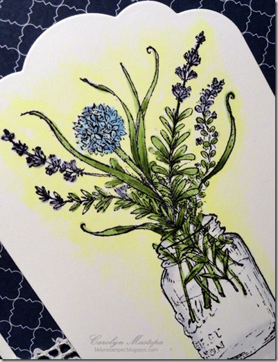
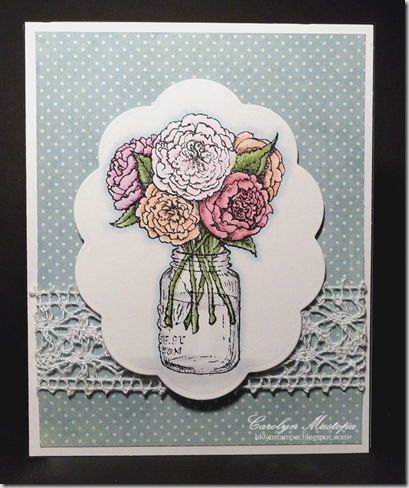
flourishes_closeup_blue I had a lot of fun coloring these. I’m not pretending I have mad coloring skills, but I think I’ve gotten better with practice. As you can see, the layout I used was quite simple. I rummaged through my gazillion paper pads and found coordinating, simple patterns to layer them on, and embellished each with a strip of white lace from my stash. Each image is colored with 6 billion Copic markers, and cut out with a different Nestabilities die.

I do have more things to show you. I’ve actually done quite a bit of creating in the week or so since I’ve been back. Maybe I’ll post another couple of cards tomorrow.

Until then, enjoy the rest of your weekend!

CMsignature

Tuesday, July 17, 2012

IHP DT Challenge: Pile it on, use it up!

This month our challenge was pretty much a free-for-all: use as many IHP products as we could pile onto our project without it looking garish. I know that Kate is trying to clear up space for the new stuff she’s ordering from this summer’s CHA releases (I’ll talk more about that further down), so I took that to mean we should try to use up some of our stash. As if I could even begin to…

new-digs I started by selecting a sketch that had lots of layers – what better way to pile on the paper! The Sweet Sunday SSSC163Sketch Challenge this week fit the bill perfectly. I decided to turn it on its side, since I wanted to do a horizontal arrangement of the stamps.

My son and his family are moving to Boston this month (yaaaayyy!!!! Closer to grandma!), so I was inspired to use this Paper Smooches set, Vogue Abode, to celebrate the occasion. I used Basic Grey’s PB&J paper pad (5 different patterns from it), since it seemed to go with the retro look of the furniture. I paper-pieced the chairs and used Copic markers to finish them off. You can’t really tell, but the dark color in the papers is navy blue (as is the card base), making for a very cool, retro look. The vase in the center is coated with Crackle Accents (although I think the item was a little too small to really take advantage of the crackling effect).

The flower, which picks up the design in the base print, was made by punching out a 1” circle of Scor-Tape sheet, peeling the backing off one side, and starting at the outer edge, pressing this ruffled lace on, winding around to the middle. I stuck a cool square olive green button onto the middle with a clear pop-dot. Because the flower was built on a double-sided adhesive base, I just had to peel off the other side of the backing to stick it on!

Here’s a list of all the IHP products I used:
Stamps: Vogue Abode (Paper Smooches)
Ink: Memento black, Copic Markers 
Paper: PB&J 6x6 pad (Basic Grey)
Other: Scor-Tape 6x6 tiles, 5/8" Picnic Ruffles Aqua Blue, Crackle Accents

You should really head over to i {heart} papers right now, you know, because Kate is having a super-duper sale to clear out space for the new CHA stuff she’s ordering. Seriously, a really good sale from July 11-21.

  • 25% off your order of $50 or more!
  • Coupon code: CHA2012DT
  • Storewide sale! Paper, Copics & refills, stamps, ribbon, everything!
  • And still, as always, free US shipping with your $60 order!

But before you go shopping, check out the rest of the design team’s projects for a little added inspiration (to add to your shopping list?). Check ‘em out:

Happy hoppin’ and shoppin’!

CMsignature

Wednesday, July 11, 2012

A couple of cards (and an awesome SALE)

Oh, my poor neglected blog! It’s been so hot here in NYC lately that I haven’t felt much like doing anything besides sitting in front of my fan. I am too cheap to run my A/C except when I have to bake. I do have a couple of cards to show you, though. You’ll notice that they are very minimalist in style, reflecting my desire to do as little as possible due to the weather.

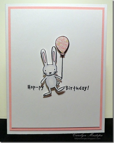
hoppy-birthday-bunny First up is this Hop-py Birthday bunny, inspired by a card by Clare Pretzzia in the recent issue of Stamp It! Cards. I used the Chicken Girl Design set Birthday Wishes (exclusive to i {heart} papers), fussy-cutting the bunny and balloon and popping them up with foam dots. The bunny is colored with Copic markers, and the balloon is paper-pieced with a scrap from the Pixie paper pack by Memory Box. I split the greeting up on either side of the bunny. You can see that I just used some very simple layering for the card design.

birthday-cake Here’s some more simple layering. I truly need to keep better track of my inspirations; I know I got the idea of creating a cake out of words from somewhere, and I can’t remember where. The cake is made with the Birthday stamp (which I could have lined up a little better) from the Technique Tuesday set Swanky Sentiments, and the cake plate and candles are from the Mint Motif sets Cake Shoppe and Cake Shoppe, Too (both exclusive to i {heart} papers as well). Some Copic markers and Stickles finish it off. I scallop-punched the bottom of the main panel to mimic the scallops under the cake.

ihp-logoYou’ll notice that all of the supplies I’ve mentioned are available from i {heart} papers. Kate has some of the BESTEST stuff around, and starting today, for a limited time, she’s making it especially rewarding for you to stash some of it away for yourself. She’s having a HUGE Pre-CHA clearance sale from July 11-21.

  • 25% off your order of $50 or more!
  • Coupon code: CHA2012DT
  • Storewide sale! Paper, Copics & refills, stamps, ribbon, everything!
  • And still, as always, free US shipping with your $60 order!

OK folks. Go do a little shopping, and keep COOL!

CMsignature

Tuesday, June 19, 2012

IHP June DT Challenge: Studio Calico Journal Kit

This month the i {heart} papers Design Team is showcasing these very cool 4x8” Journal Kits by Studio Calico. We also have a very special Guest Designer joining us this month: Michele Gross!

Not being a journaler (is that a word? my spell-check seems to think not), this was initially a very daunting challenge for me. I had already made a gratitude journal that I never used (shame on me).

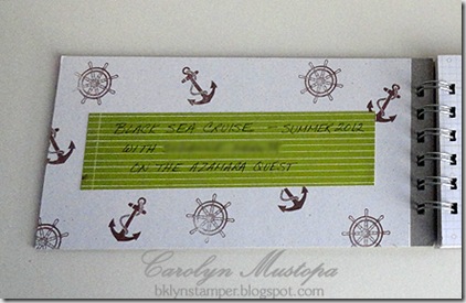
And then I realized that since I am going on an amazing cruise of the Black Sea with my sister this summer, it would be great to have someplace to jot down notes along the way to help me remember it better, tuck away a few keepsakes, and maybe eventually add some photos.

cruisejournal-cover I started by coating the front cover with white pigment ink and then embossing it with clear embossing powder. I cut a strip of paper from the Take Note 6x6 pad, also by Studio Calico. The colors and design seemed to reflect the feel of Turkey, which is where our trip begins.

The stamps I used for the whole project are from the Technique Tuesday set called R & R. How perfect, right? I stamped them with Memento Rich Cocoa ink and colored the image with Copic markers. And I finally got to use my Bind-It-All!

Inside the front cover, I adhered another piece of paper from that Take Note pad to write down the details of the trip.
cruisejournal-insidecover I didn’t think about covering the board before I put the thing together, so I just cut a piece of cardstock a little short of the binding. Lesson learned.

All of the inside pages are stamped with another stamp from the R & R set.
cruisejournal-inside I figured I can circle one of the phrases on each page depending on where we are when I am writing. I love how the pages are printed with a grid to make writing easier!

To keep track of little mementos, I bound a few envelopes into the book.
cruisejournal-envelope I snipped off a corner of the flap so it wouldn’t get caught in the binding.

Time will tell whether I actually use this very cute journal, given my track record, but I will try.

I hope you’re as excited as I am to see how the rest of the Design Team used this product. If you make one, please share with the rest of us by using the keyword “ihp0612” when you upload it to the SCS or PCP galleries.

Now let’s go check these out:

Happy cruising – I mean blog-hopping!

CMsignature

Sunday, June 17, 2012

Happy Father’s Day!

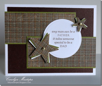
Here are a few cards for all the dads, granddads, stepdads, and especially the NEW dads out there! Don’t have time to provide many details right now – overslept and I need to get moving.

fathersday-blue-limeUses Technique Tuesday’s Swanky Sentiments stamp set.

fathersday-screwBottom border uses Mint Motif’s Beyond Borders, Too. Greeting and texture plate from PTI.

fathersday-yusuf12

Stamps and texture plate from PTI.

Have a great day, all!

CMsignature

Saturday, June 2, 2012

Look, Ma -- no coloring!

Not a bit! And no bling, and no ribbon! But I did use the same simple layout and the same dies as the last card I posted. And more supplies from i {heart} papers.
new-baby-clothesline I just love that Floral Ovals die from Spellbinders. Apparently lots of others do too, because Kate keeps selling out of it! This time I used one of the Large Ovals dies to cut it into a frame. Then I used one of the Small Ovals dies to cut a hole in the rose cardstock layer (hint: temporarily adhere the frame to the layer, place the smaller die inside, and run the whole thing through the Big Shot for perfect placement!).

I lightly traced the oval cutout onto the white base card for easy placement of the stamped image. These stamps are from On the Line, by Gourmet Rubber Stamps. (hint: erase the pencil marks after the ink is dry, and before you assemble the card – don’t ask.) I paper-pieced the little baby clothes with papers from the Basic Grey Konnichiwa 6x6 pad. The rose layer is then attached to the base with foam dots.

Hope you like the card, and that you find the hints helpful. Someone should learn from my mistakes, since I seem not to!

CMsignature

May the bluebird of happiness…

OK, I need someone old like me to help me remember which show from long ago had a shtick that started with this. Was it Laugh-In? I think Johnny Carson used it, too.bluebird-birthdayAnyhow, this is just a pretty birthday card made with some of my favorite goodies from i {heart} papers, some old, some new. You can tell I’ve been in the mood for coloring lately.

What I used:
Stamps
: Bird on Dogwood Branch (Stampavie); Everything Happy (Stampendous)
Ink: Memento black, Copic markers 
Paper: Everyday Moments (Teresa Collins)
Other: Ovals, and Floral Ovals dies (Spellbinders) – seems to be out of stock. If you ask nicely, maybe Kate can get more in.

Have a wonderful weekend, and may the bluebird of happiness…well, do whatever it’s supposed to do.

CMsignature

Sunday, May 27, 2012

Playing Catch-up (again)

I’ve had these cards photographed and ready to post for weeks. These, and more. But we’ll start with these.

brighter-days-window3

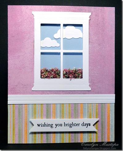
All supplies, other than the cardstock, are from i {heart} papers. This one uses paper from the Basic Grey Plumeria pad. I actually made 3 of these using paper from that pad, as you’ll see below. The window was made with the Memory Box Small Madison Window die, the clouds are made with the Puffy Clouds die. I made the molding by just scoring a strip of white cardstock. The greeting banner was notched by hand; the stamp is from the Mint Motif set Simply Sentiments (exclusive to IHP). The flowers showing through the window are Flower Soft. What you can’t tell from the photo is that the base card is light blue, and the whole “wall” is a separate layer attached with foam dots, with the clouds and flowers glued onto the blue base.

brighter-days-combo 
The next one uses paper from the Kaiser Craft Charlotte’s Dream pad.
perfect The pattern on the peach-y paper is much prettier in real life – it’s shiny embossed. The sentiment on the focal piece, which was cut with the Spellbinders Floral Ovals die, is from the Hero Arts set Good Friends, which I’ve been giving a good workout! The image stamped behind the sentiment is – hmmmm, I honestly can’t remember where I pulled that from. If I find it I’ll come back and fix the post.

Anyhow, it’s embellished with a few pearls, and a few fabric flowers that were trimmed from a strip of the Tim Holtz Lavish trimmings. Now, the trimmings in the package are off-white, but I airbrushed them with a Copic marker to make them match the paper. Magic!

OK folks, that’s enough for now. I’ve got more to share, but you’ll have to wait a bit.

Hope you’re enjoying your weekend!
CMsignature

Saturday, May 19, 2012

Still Coloring…

OK, coloring again. I did stop and do other things, like get out and enjoy a bit of the gorgeous weather we’re having here in NYC today. But more flower images were calling me, and I’m soooo weak….
parrot-tulipsAnother little set from Taylored Expressions – Spring Tulips. Again, no greeting. It can be an “anything” card. No bling, nor ribbon, just the pretty flowers and more of the lovely paper from the Teresa Collins Fabrications line.

Pretty flowers make me happy.

Be happy.
CMsignature